0 to 1 - Advocating, Designing and Building
Education Personnel Evaluation Web Application

Product Designer
Front-end Developer
Database Design
Total overhaul of the existing Kansas Educator Evaluation Program Web Application for launch fall 2015.
Utilize Bootstrap frontend framework (first project at KSDE to shift to this framework from tables-based UI)
Continue to meet Kansas State Statute relating to educator evaluation
1 back-end developer available
I needed to continue to perform job as program consultant while doing this re-design and re-build
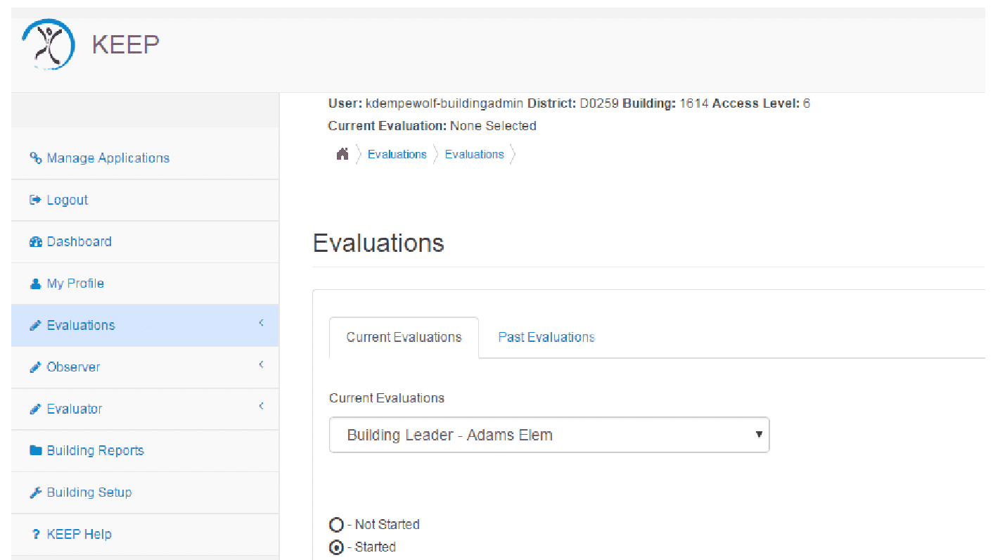
An outdated, rigid portal that was frustrating and not widely adopted across the state was transformed into one that implemented heuristic principles, allowed customization by a district, and resulted in greater adoption which saved districts money as they utilized the free state-provided tool instead.
Impact
first month post launch compared to previous year
Number of districts utilizing free KEEP2 application instead of 3rd party paid program
12% Increase
Process
01
User Research & Advocacy
I served as a resource and trainer for educator evaluation in the state and the state's custom tool: Kansas Educator Evaluator Program (KEEP) web application.
From my very first exposure to the application, I knew there was lots of room for improvement.
The phone calls, questions and requests I received from educators and administrators across the state let me know that others thought so as well!
I created a list of recommendations and met with stakeholders in my department as well as the IT department.
My background of coding and UX/UI, combined with my extensive experience as a classroom teacher allowed me to effectively communicate with both the developers and the end users.
They agreed to let me run with it - and I did!
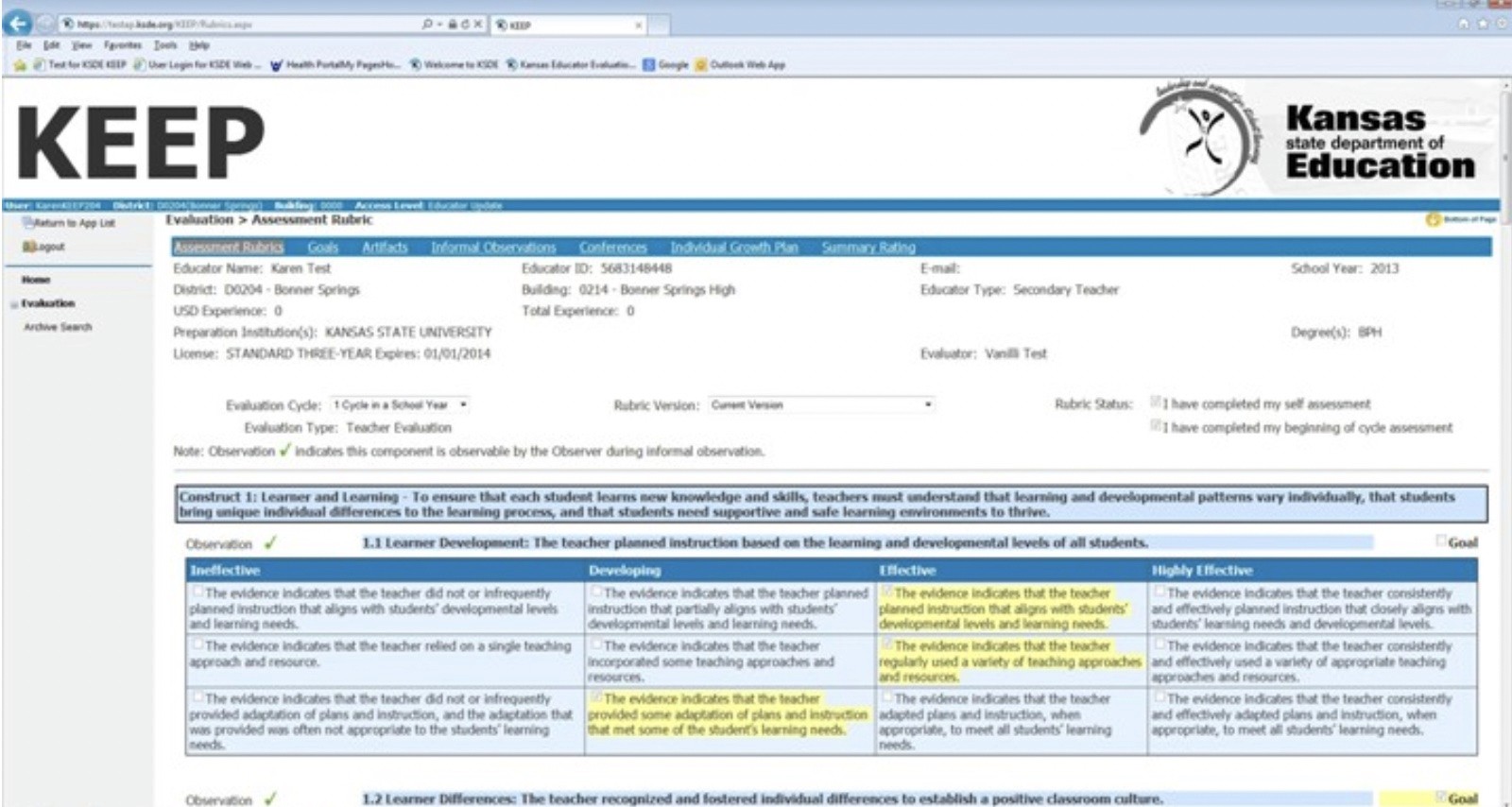
The original web application had an outdated look and feel, was very inflexible and often frustrating to users when it couldn't do what they needed.
02
Heuristics & User Needs
The existing product broke literally every single heuristic principle in so many ways…actually, I might start using this as a scavenger hunt for the UX/UI students that I teach!

Take away
This was no case when you can make tweaks and iterations and inch towards better user experience…it definitely needed a full design from the ground up!
03
Design, Testing, Iteration & Development
Sketches to Prototypes
I walked end users and IT stakeholders through the paper sketches, wireframes and prototypes, gathering feedback and iterating between presentations.
Usability Testing
Internal and external usability testing drove iterations.
Collaborating with Developers
I met frequently with the back-end developer to coordinate database design, front-end work and hand-off for connection to the back-end.
Front-end Developer
I coded the UI using the Bootstrap framework to conform with the IT departments style guides and direction they were headed with their new system-wide look.
04
Improving UX and Alleviating Pain Points

Heuristics
The portal now adheres to all the heuristic principles!
Usable navigation, progress indicators, flexibility, error prevention, etc.
User Interface
Built with Bootstrap, the user interface is now clean with plenty of white space, appropriate hierarchy and a consistent design system.
Adding in features that weren't there before
User pain points lead to new features - such as allowing users to attach artifacts to their self-assessment WHILE they're completing the assessment…as well as on the dedicated artifact page.

Impact
Workflows that worked for educators:
Districts uploading their custom evaluation rubrics to be utilized within the web-application framework
Users "pulling in" goals and self-assessments from the previous semester/year to allow editing for the current evaluation cycle rather than starting from scratch
Dashboard landing page with recent announcements and pending tasks
Progress indicators
Maintaining historical data (the previous version wiped for a clean-slate each academic year)
An in-app discussion feature to document all messages sent concerning evaluations in one place (as opposed to digging through emails in a separate application to find a previously sent message)
…and so many more!
05
UX Outside the Product
I used my cognition & instructional design background to write documention that was far more helpful to users.

06
Reflections
The difference that having a UX professional on a project makes cannot be under-estimated!
The previous portal was built by developers with state department of education employee input.
I designed the new portal beginning with extensive user research, and continued to iterate with dozens of usability tests. The results was a product that met the business outcomes (increase district utilization of this free tool to save school districts money) BECAUSE it better met the needs of users!
I wish I'd continued in the position longer to continue to refine and develop new functionality.
I took the opportunity to become a business owner and launch an allergy-friendly bakery about two months after the new product launched. It has not been significantly changed or updated in the 9 years since the launch and I know there were lots more ideas in my head at the time about how to better serve educators during their evaluation process!